AI Art Generation: Analyzing stylistic consistency across AI models using ComfyUI
Posted on: 2025-03-07
As part of my research this week, I decided to compare various text-to-image models using a popular AI tool called ComfyUI. The goal of this experiment was to see to what degree the model selection can influence results, whether stylistically or otherwise. In this test, I only use the default workflow, setting the same options for each set, with no LoRA or any other node, only changing the model checkpoint. All of these models are available as free downloads on CivitAI and can be run in just a few seconds on a typical gaming PC (I used a Ryzen 5 7600 with 32GB RAM and a GTX 4060 GPU with 8GB VRAM).
In order to be fair, I ran each prompt through each model four times, using random seeds, and took the image I thought looked the best among those four. There was no retouching done, and neither the prompt nor settings were adjusted between runs. With that said, this isn't meant to be a scientifically accurate experiment. I ran this mostly for my own curiosity, and because I thought it was a fascinating experiment.
Girl in the countryside

The first set shows the eight models I selected, all with the same prompt, a young woman in an outdoor setting. The first highlight that can immediately be seen is the stylistic diversity. Some models (like waiANINSFWPONYXL, hassakuXLIllustrious and midnight) produce very anime/illustrated styles whereas others (flux1-dev, dreamArtFusion and cyberrealisticPony) tend more towards photorealism. The next thing that surprised me is how consistent they were with prompt interpretation. Despite using different models and seeds, there's remarkable consistency in the core elements like the girl's hair, headband, the outdoors setting, the clothing and so on.
With that said, there are also obvious differences. Each model has its own aesthetic signature where the model seems to be balancing the various elements of the prompt with its own training. There are also some visual elements that vary between models, like how some backgrounds focus on a rural setting, but others introduce some urban elements. The facial features also differ, with some images showing a neutral expression while others have a more serious or intense look. Finally, the color and lighting differences show how some models prioritize warm, natural tones, while others focus on the high-contrast lighting.
This set already highlights how different models can act as artistic filters that maintain the core subject while applying different visual languages to the same prompt. It reveals how each model has a different attention mechanism. Some weight physical descriptors more heavily, while others prioritize scene composition. Each has its own interpretation of abstract wording like "practical yet stylish" or "rugged".
Vampire themed portrait
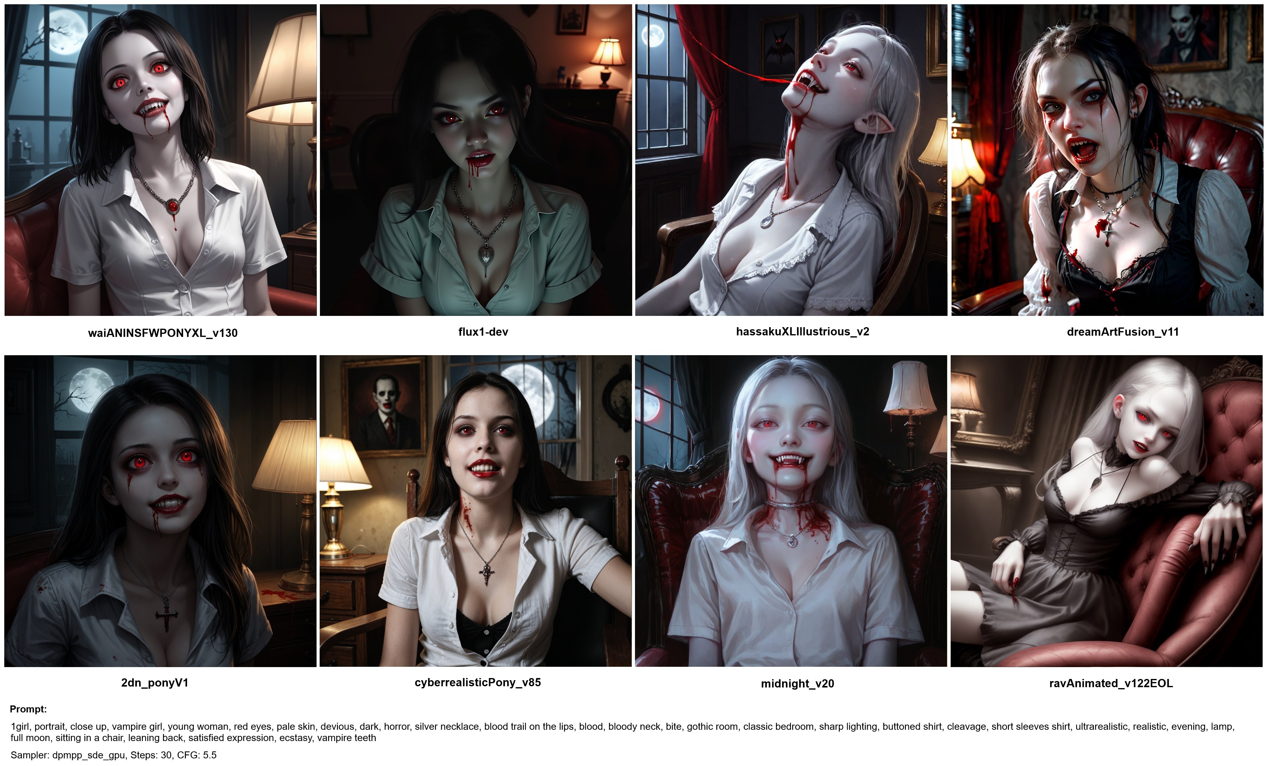
The goal of this prompt was to focus on a more extreme, horror themed scene, which would offer a greater degree of interpretation. Right away we can see the consistent model signatures, where the models that produced an artistic style in the first set, replicate this process here, while the more photorealistic models retain their realistic approach. The prompt is also adhered to by all the models, with some of the keywords like "red eyes", "blood trail" and "silver necklace" being present in each of the images. Interestingly enough, all the models picked up on the need for the scene to be more vibrant and striking, versus a more neutral look for the first set.
Some key differences include the content handling variance, where some models handle the horror/gothic asthetic more naturally than others. The same can be said for the lighting requirements ("sharp lighting" vs "soft and diffused") where some models seem to excel at dramatic horror lighting but struggled with the softer outdoor lighting. The artistic models also seem to handle the vampire asthetic with more confidence, like the hassakuXLIllustrious model adding pointed ears to the girl. Emotional expression also varies a lot more in this set than in the previous one, with each model handling "devious" and "satisfied" in different ways.
This test shows that models not only have different styles, but handle different types of scenes differently, and have thematic comfort zones and interpretations of emotionally-charged concepts.
Medieval landscape

The point of this prompt was to test the models with a landscape prompt. Some of the highlights includes the fact that scale handling differs between models. Some show close-up scenes whereas others present a panoramic vista. The backgrounds vary a lot between models as well, and so do the water features. Each model also seems to have a different architectural vocabulary, where some created fantasy scenes and others went for more realistic medieval towns. Nethertheless, the style remains consistent with the previous sets, with some models still going for an artistic scene while others are more realistic. And while some models prefered centered, symmetrical compositions, others went for a dynamic, off-center arrangement.
Overall, I think this was a very interesting experiment, and it showed that AI image models not only have different visual styles, but fundamentally different approaches to composition, detail allocation and prompt interpretation. Each scene could obviously be refined through negative prompts, using LoRA models, and other techniques, but this test shows that simple model selection plays a huge part in the finished product.